Picture/Readings
Barbara Kruger was born in 1945 in New Jersey, the daughter of a chemical technician and a secretary. She would attended Syracuse University in 1965 for just one year before the death of her father. Afterwards, she moved on to Parsons School of Design in New York for a single semester before opting to jump straight into the graphic design industry to make a name for herself. After spending a decade working for various media outlets such as Conde Nast and Artforum. It was while exploring modern art where she would become disillusioned with abstraction - a realization which would influence the direct-address approach of her later work. She then moved to Berkeley, California, where she taught at the University of California and became inspired by the writings of Walter Benjamin and Roland Barthes. In 1977, she returned to making art, working with her own architectural photographs and publishing an art book, Picture/Readings, in 1979. She was inspired to photograph architecture by her family’s practice of touring "model homes they could never afford."
 Barbara Kruger in New York, 1990.
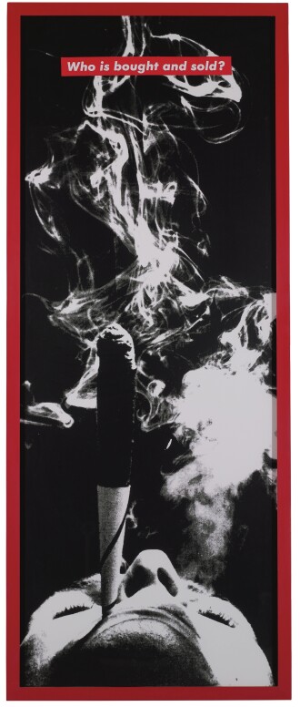
Much of Kruger's work pairs found photographs with pithy and assertive text that challenges the viewer, known as word art. Her method includes developing her ideas on a computer, later transferring the results (often billboard-sized) into printed images. Examples of her instantly recognizable slogans include "I shop therefore I am", "Your body is a battleground," and "You are not yourself" appearing in her signature white letters against a red background. Most of her work deals with provocative topics like feminism, consumerism, and individual autonomy and desire, frequently appropriating images from mainstream magazines and using her bold phrases to frame them in a new context.

"Who is bought and sold?"
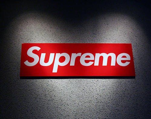
Supreme Clientele
In 1987, Barbara would publish "Love for Sale: The Words and Pictures of Barbara Kruger". It was this book that would make its way into the hands of a designer working with James Jebbia, an up-and-coming N.Y.C streetwear empresario who was looking for inspiration for his new product line simply named,"Supreme". The designer quickly returned what would become the brand's flagship logo. A simple red box with "Supreme" written in a italic Futura font.

The red logo is instantly recognizable today as the foremost brand in streetwear/urban wear and although minimal, has made a giant impact in terms of its use as a marketing tool. Supreme is known for it's extremely-limited releases and scheduled "drops" where individual Supreme stores release items at set dates and times, generating insane queues at their stores on drop days. Often the items are mundane everyday objects with a Supreme logo plastered on them, or often simply a white tee with logo. They usually sell for reasonable though marked-up prices which are then marked-up 1000% by sellers on eBay and other auction sites - with desperate buyers forking over thousands for mere material satisfaction.
The irony seems completely lost on this group of people, who seek self-validation through material posessions, unaware that the very idol they worship was made in the image of the symbols that criticized the same culture of mindless-consumerism that they embody. The Supreme clay brick re-sells for 500$
All is Fair in Love and Design
While Kruger took no offense to her art style being used as a corporate logo, citing a belief in Creative Commons which ethically prevents her from taking legal action for copyright infringement - Barbara could not sit quietly when the now-fashion giant decided to go after an independent creator who simply spun their logo into a "Supreme Bitch" design for use in her clothing line. Jebbia and Supreme launched a lawsuit which accused the "Supreme Bitch" creator of copyright infringement. This infuriated Kruger who was quoted as saying:
"What a ridiculous clusterfuck of totally uncool jokers. I make my work about this kind of sadly foolish farce. I'm waiting for all of them to sue me for copyright infringement."
--- B. Kruger
Eventually the lawsuits were dropped upon the parties reaching an agreement that the "Supreme Bitch" creator could continue to use the phrase "Supreme Bitch" as long as it was "not in the way Barbara Kruger does." Thereby acknowledging the influence her art had on their brand and giving Barbara the recognition she deserved for her work - though her powerful and self-reflective message was lost on them and their customers.
---